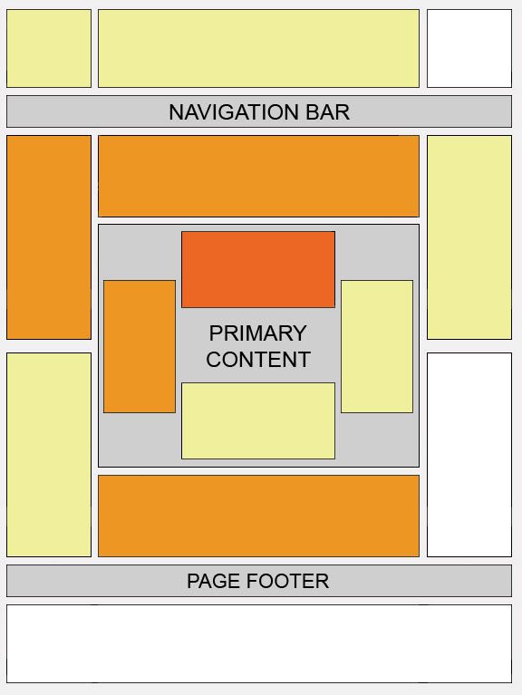
Google AdSense needs no introduction. It is the most widely used and readily available online advertising program. What I mean by readily available is that their criteria for joining is pretty low. Unlike other Pay Per Click (PPC) advertising programs like Chitika which require your site to have at least 10,000 page views per month, AdSense does not have such requirements. I manage to apply for my AdSense account within 3 days of setting up my Vitamin and Health blog with about 10 page views per day. While this heat map is useful as a positioning guideline, I strongly recommend putting your users first when deciding on ad placement. Imagine watching a movie with constant ads appearing - it can very annoying. You will definitely want users to return to your site and not turn them off ya.
Where should I put my Google Ads on my pages?
Studies have shown that certain locations in your page tends to be more successful than others because this is where people tend to focus on. This "heat map" illustrates these ideal placements on a sample page layout. The colors fade from dark orange (strongest performance) to light yellow (weakest performance). All other things being equal, ad placements above the fold tend to perform better than those below the fold. Ads placed near rich content and navigational aids usually do well because users are focused on those areas of a page.
In my next post, I will show you how it is done.
http://mma-nba.blogspot.com/